When furnishing your home, it is just as important to know what decorating trends to avoid as it is to know techniques for good interior design. Ever had that nagging feeling that your furniture setup doesn’t look quite right? Perhaps you loved a wall color on the swatch but now you’re regretting the choice? You’re not alone – we all make common mistakes when decorating our new homes. But the good news is that many decorating blunders are easy to avoid and fix.
Keep reading for 8 common interior design mistakes and how to remedy them.
1. Creating overly themed rooms
It’s often wise to consider the architecture of your home and follow some of the most popular interior design styles when beginning a project. However, rooms that are too thematic can look tacky and one-dimensional. If you want to have that chic and trendy Pinterest-like aesthetic (as opposed to stale catalog photos shot by Bob’s Discount Furniture), avoid sticking to a single design theme.
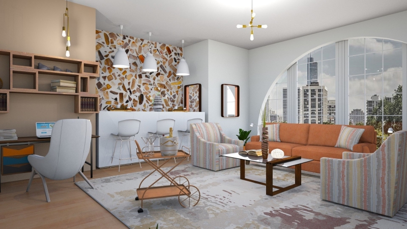
For example, if you have a 1970s home or apartment, you don’t have to go overboard on the retro furniture. Even though I love mid-century modern design, it’s often sufficient to include just 3-4 pieces. You don’t want your interior design to be a stage set for Mad Men! If you choose iconic mid-century modern furniture pieces, try to diversify your rug, art, pillows, and lighting with pieces from other interior design styles.
Likewise, if you live in a contemporary home but love antique furniture there’s no harm in mixing old and new. Having too much antique and vintage artifacts may cause your interior to look outdated without the charm factor. By introducing some bold modern pieces, you can create a new point of focus that is eye-catching and unique.
2. Buying matching sets of furniture
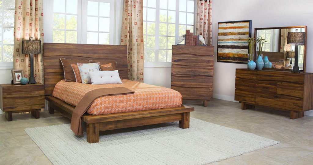
Avoid buying matchy-matchy furniture, as it tends to look too uniform and boring. Matching furniture sets removes diversity of design and exudes an uncreative feel. Mix old and new, different styles and colors and materials for a more eclectic and dynamic aesthetic. Every individual furniture piece should add something unique so don’t be lazy.
Reference the above photo. Any individual piece in that bedroom can be beautiful – actually, the rustic wood, low platform bed, and thick trunk legs are all great! However, matching every pieces of bedroom furniture makes the room stale and takes the uniqueness out of each individual furniture piece.
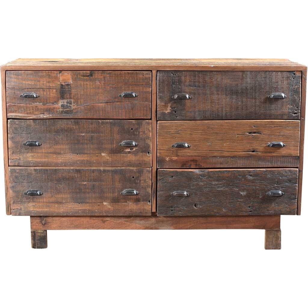
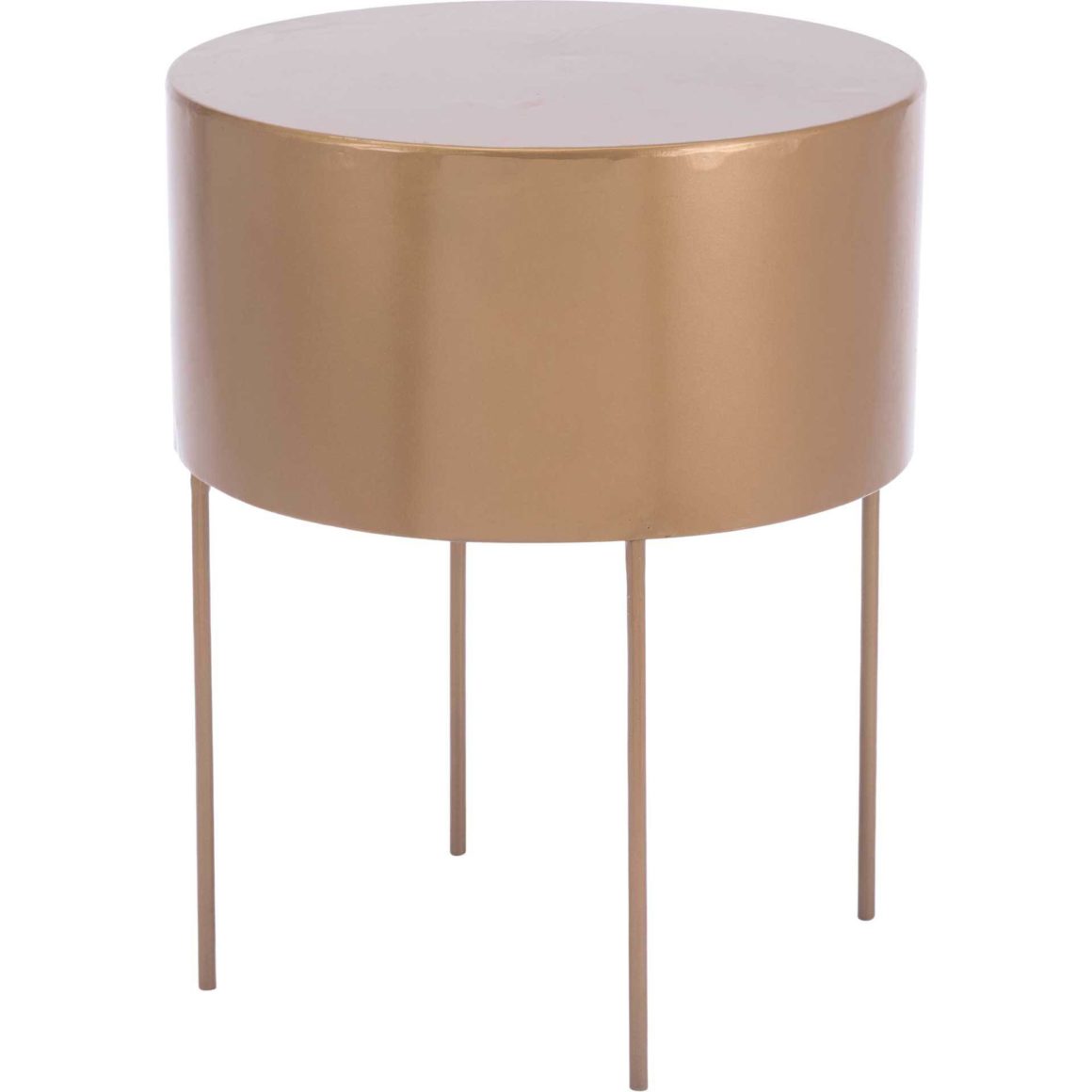
If it were up to me, I would keep the bed and replace the nightstand with the Bor End Table and the dresser with the Klonoa Dresser. I would remove the other dresser entirely. Note that both replacement pieces would still maintain a matching color theme, but the materials, finish, and patterns create a more diverse feel. The curtains and wall art would have to go as well.
3. Placing furniture up against the walls
People often fall into the styling trap of pushing all their furniture pieces against the walls of their rooms. But it tends to look awkward and really doesn’t save or create more space.
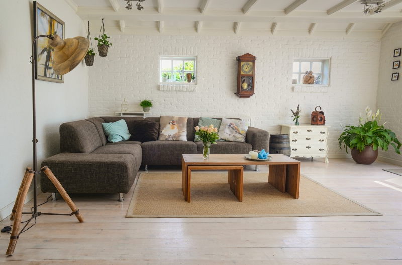
Focus instead on creating conversational areas and grouping accents. Pull furniture away from the walls and angle pieces toward one another to create more intimate, useful seating.
If you’re unsure, use a sketch pad to draw a basic plan and play with the placement of your furniture. All professional interior designers do this to make sure they have the best layout for their target decor.
If you decide you need another chair or want to swap out an existing sofa, check out our furniture collection for the perfect piece.
4. Make sure colors match
Many common interior design mistakes have to do with color choice. Whether it be the wall color, furniture color or accent color, you may have loved it on the swatch but now it’s just not doing it for you.
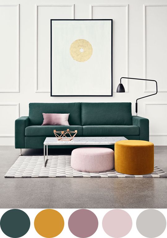
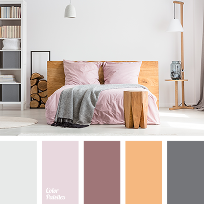
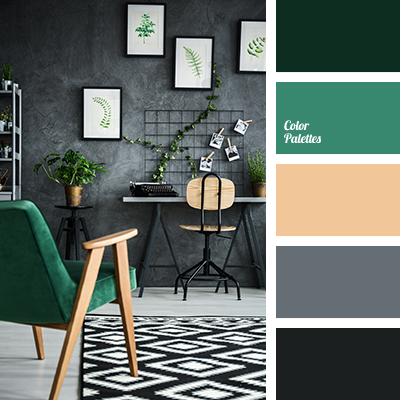
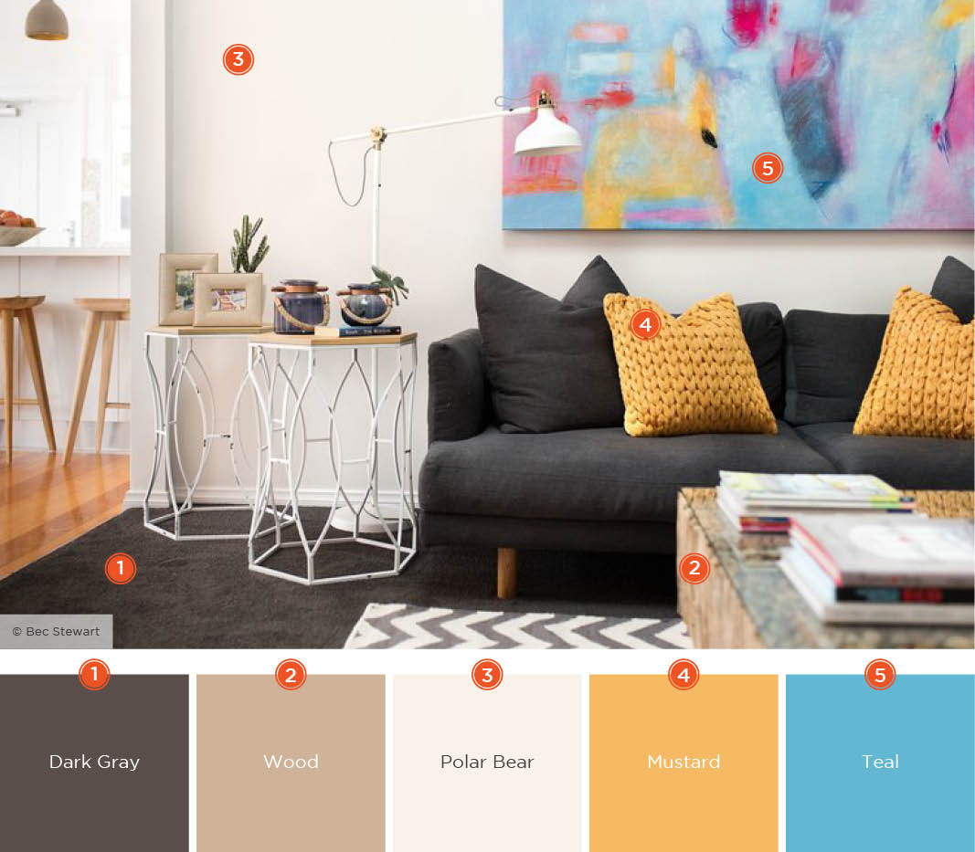
For creative color palette ideas, use the color palette generator or explore online for pre-made sets by trending interior designs.
Before you rush out and attempt to return the sofa or buy more paint, especially if budget is an issue, think about other colors or materials you can bring in to contrast it. Some colors look their best when paired with an enhancing hue.
For example, if you’ve gone with beige or cream for the main room color, use feminine, pastel hues like light pink, mauve, peach, lilac or lavender to brighten the space. Add decor, such as throw pillows, rugs, and window treatments with darker shades on the same spectrum, to tie it all together. Our decor collection has some great options to choose from.
In the future, before you start painting a big space, test the color on a large piece of card and attach it to the wall so you can see how it looks under natural lighting.
5. Having only one light source
Speaking of lighting, this is an often overlooked feature for house decorations. Many people make the mistake of using only one overhead light source, which is usually woefully inadequate for the size of the room.

To create ambience you need to have layered lighting sources, such as:
- ambient lighting – for overall illumination (e.g. pendants, recessed lights, track lighting, floor lamps)
- task lighting – illumination for a specific function (e.g. pendants, table lamps, vanity lights, desk lamps or under-cabinet lighting)
- accent lighting – illumination for certain objects or architectural features (e.g recessed and track lighting, specialty lighting, and wall sconces).

A good lighting plan for interior home decoration will combine all three sources, and at different heights. For example, a lounge could have pendants, floor lamps and table lamps. Check out some of our great lighting options to add more illumination to your home.
Bulb color is important too, avoid fluorescent or white lights and go for warm lighting to make a room feel intimate and welcoming. Never combine bright white and warm yellow bulb types as it will create a very awkward lighting balance.
If you want to check whether a room is adequately lit, then follow this formula:
Room Length x Room Width x 1.5 = Recommended wattage to light a room.
6. Not measuring the space
Not planning space usage is a common interior design mistake people make. Don’t rely on your eyes to measure a space. Before purchasing furniture or decorative accents, measure all the dimensions (both in relation to the room and to each other) to map out your space to avoid overcrowding or under-furnishing.
This is especially true for rugs. An improperly sized rug that is too small can make your room look disorienting. In these cases, it’s often better to not have a rug at all.
Blue painters tape is handy for mapping out where furniture will go so you can visually see how much space you actually have to work with.
7. Cluttering up the space
Cluttering up the space is a knock-on effect of either not measuring the space or lacking any concrete plan for cleaning and organizing. The result can be oversized furniture that makes a room feel overcrowded and cramped, or too much furniture making a space difficult to move about in.

The best way to deal with clutter is to remove pieces that you can do without until the room can breathe and order is restored. A general rule of thumb for interior home decoration is allowing 30 inches between furniture pieces for traffic flow, and 14 to 18 inches between a coffee table and sofa so you can reach drinks/magazines etc.
8. Not following your own personal aesthetic
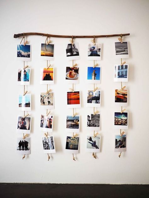
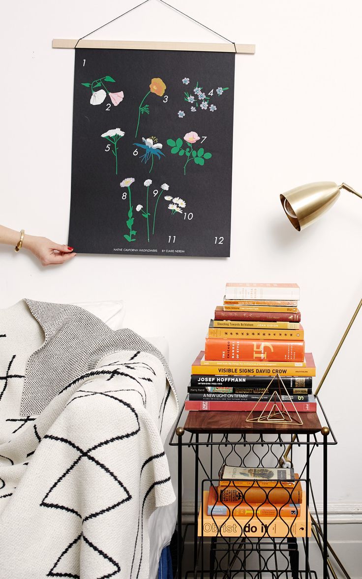
If you scroll through interior design websites, you’ll notice the photos of the most luxurious rooms all have one thing in common. The furniture, decor and lighting are all usually high-end designer brands and it’s been perfectly placed and accented to showcase the room in its best light.
When trying to decide what you like, rooms such as these can serve as valuable inspiration. But copying someone else’s design choices to the letter is a mistake, because you’ll end up with a cookie cutter replica with none of your own personality. It’s better to ask yourself what you admire about the rooms – is it the colors, the textures, the materials, the lighting, the era of the furniture?
Once you’ve narrowed down your preferences, then you can begin your own interior home decoration journey with confidence. Rather than a blindly following trends or calling in a professional homestyler, use furniture, materials and colors that you love to make your house a home.



3 comments
Great suggestion on thinking of your own tasted and aesthetic. It seems a lot of people try to hard to match trends and copy images rather than find what they like. They would be much better served figuring out why they like styles and creating their own mix. Love the tip.
Hey Angela, Very well researched post and definitely gonna help many interior designers. Thanks
Thank you Angela for sharing this blog with us. I gained the knowledge of most common interior design mistakes. Great content covered in this Interesting blog.